As part of its ongoing effort to adapt to the evolving tech landscape, Google has revealed a refreshed version of its long-standing logo. This update, marking the first redesign in nearly ten years, highlights Google’s shift towards artificial intelligence and innovation, reinforcing its position as a leader in the digital world.
Google’s Legacy: A Quick Overview of Its Previous Logo
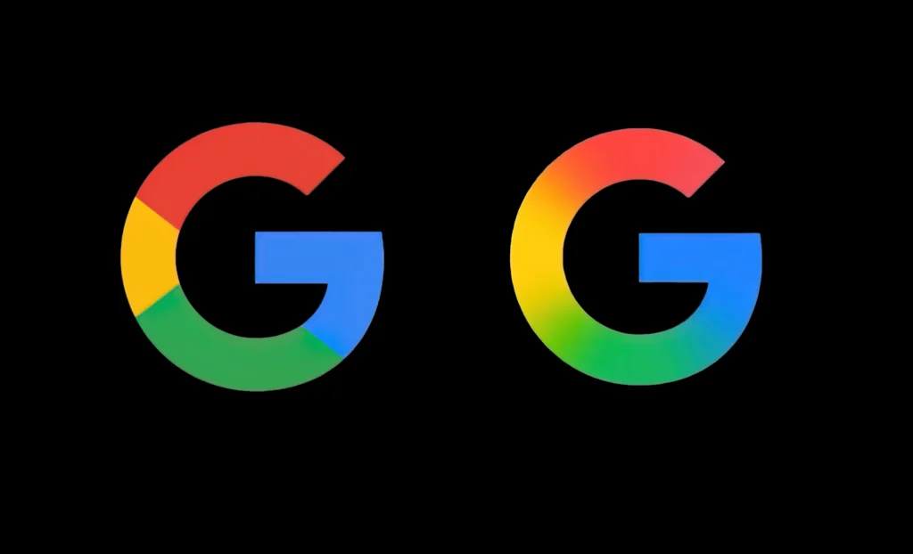
Introduced in 2015, Google’s previous logo was a simple and recognizable design featuring bold, solid colors. This logo became synonymous with the brand, embodying the company’s approachable and user-friendly image. But as Google continues to evolve and explore new technologies, particularly in AI, a new visual identity was needed to represent its next phase of growth.
Refining the Brand: A Subtle Update with a Bigger Purpose
The newly unveiled logo maintains many of the original design’s core elements while subtly refining its aesthetic. The shift in design reflects Google’s renewed focus on innovation, particularly its push into artificial intelligence, which is transforming the way the company interacts with users and businesses alike.
The updated logo is already visible on the Google Search app for iOS and will soon appear on Android devices, starting with the Pixel phones. However, Google’s familiar color-segmented “G” remains on the web and other Android smartphones, indicating that the transition to the new logo will be gradual.
A History of Evolution: Google’s Changing Logos Over the Years
Since its inception in 1998, Google has made numerous tweaks to its logo. The early iterations of the logo were more playful, even featuring an exclamation mark at one point, which was characteristic of early internet brands. As the company grew, its logo became simpler and more minimalist, reflecting its shift from a quirky search engine to a global tech giant.
The recent redesign signals Google’s desire to keep its brand identity in line with its technological advancements, especially as the company positions itself as a leader in AI and digital experiences.
Mixed Reactions: Consumers Weigh In on the Updated Logo
Upon the launch of the new logo, feedback has been mixed. Some users have expressed enthusiasm for the sleek and modern look, appreciating the cleaner design, while others have poked fun at the subtlety of the update. While the change may seem understated, it represents Google’s strategic focus on the future—one that will be increasingly shaped by AI and innovative technologies.
Despite the varied reactions, the logo update is part of a larger strategy to position Google as a forward-thinking company that continues to evolve in line with technological progress. As AI and machine learning become more integral to everyday life, this logo refresh serves as a visual reminder of Google’s commitment to being at the forefront of digital transformation.